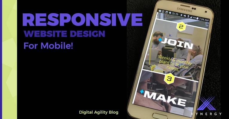
If you own a smartphone or a tablet (collectively known as mobile devices) you'll no doubt have been frustrated by websites you visit where you have to zoom in in order to actually be able to use the site and read the content. And if you own or run a website, you'll no doubt have heard about the technique known as 'responsive theming' or 'responsive design', which is the web industry's unanimous answer to the growing marketshare 'mobile devices' have when it comes to how the world is using the internet. In short, responsive design allows a website's content to be displayed differently depending on the viewer's screen size and because of the many benefits of responsive design, it's usually highly recommended on any type of website project.
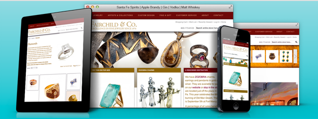
Without going into any technical details, layout and features of a website do need to be considered carefully when implementing a respnonsive website because there is a particular way that content gets 'collapsed down' for smaller screens. But whilst it is true that making a website responsive does introduce some limitations to what can be done, it certainly doesn't mean that the website has to be boring! Here at Xynergy®, we take into consideration what you're trying to achieve with your site and finds ways to get it done regardless of the viewer's screen size, including utilizing tried and tested third party plugins that can make your website stand out to your viewers. Here's a list of just a few!
- CloudZoom allows site visitors to zoom in on images, perfect for product pages where good, high-resolution photography is available.
- Revolution Slider is a multi-layer, responsive animated slider with huge visual impact, great for website homepages. Each layer is customizable, so the possibilities are endless, and it even supports video being embedded right into an individual slide.
- Owl Carousel is a responsive and touch-enabled slider which can be used for 'single item' slides like a traditional banner slider or multi-item lists where multiple items show inside the slider area and move together.
- FancyBox 2 is a powerful and responsive lightbox plugin good for wherever popups are needed such as viewing terms & conditions, contact forms, image galleries, etc.
- Isotope allows you to achieve responsive, ‘Pinterest’ style layouts that fit the space available. It also supports content filtering for refining by group/category and multiple layout fill options.
- Stackable allows you to still utilize HTML tables to display grid-based information but still be responsive and work on smaller screen sizes. Great for sites with grids of information.
- Responsive YouTube styling allows embedded YouTube videos to always fit the content area, making it a pleasure for users to watch on any screen size.
- MenuZord is a flexible responsive navigation bar that allows users to easily navigate the site without requiring overview pages for every section because the expanding/collapsing function is separate to the menu items.
Contact us for help with your Mobile Design
or Call 505-557-7780

