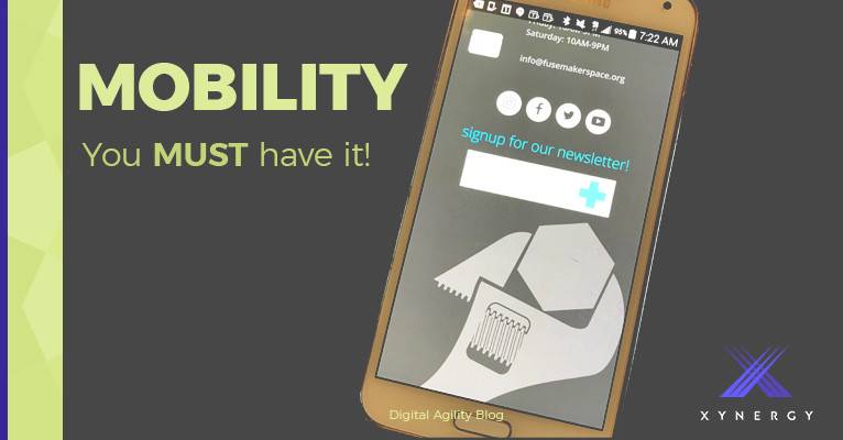
Have you ever looked at a website on your phone and just given up after trying to click on miniscule links or resizing the text of every page to actually be able to read something? Or worse, is this the experience that your site users have waiting for them on their phones? That is a very likely scenario if you have not taken the time to ensure that your site has a responsive theme.
Responsive themes are just what they sound like. We call your website design a “theme,” so a responsive theme is one that responds and adjusts intelligently to the device on which it is displayed. It doesn't live at a different web address, like m.yourdomain.com or mobile.yourdomain.com. If you see the address of the website change from the one you typed in on your phone, to one like the above, that's a good clue that you are actually looking at an alternative version of the website. That can be frustrating because often, a lot of content is simply not available on that version. It was a popular way of accommodating small screens in the early days. It is an expensive way to do so however, compared with responsive theming.
A good example of a responsive theme can be seen at our own site, xynergy.com. On a computer you can see the responsiveness by resizing your browser window to be very narrow, like iPhone width. As you shrink the screen size you can see the elements of the page alter and rearrange themselves. Then look at it on the phone and you see the same layout.
A good example of a non-responsive theme can currently be seen at gs.statcounter.com. Try the same exercise on that page, and you will see that you simply cannot view the right side of the page when you shrink the screen width far enough. Look at it on the phone and you see a miniaturized version of the page, crammed in so it all fits, but it is unreadable and unnavigable without a lot of effort. (The graph disappears on the iPhone because it uses Flash graphics, something Apple famously does not support.)
StatCounter estimates that approximately 18% of global website hits are from mobile browsers such as Safari on the iPhone and iPad, and Chrome on Android devices, and this percentage is increasing every month. If you use Google Analytics or other site monitoring tools, you can find out what percentage of your own site's visits are from mobile devices, because the statistics that are really important are not global, they are about your unique users. But even if your site is running at the average, that means one out of five of your users may be ditching your site in disgust, or worse, going to a competitor’s site instead.
Our developers like to use tools like Bootstrap and Foundation as platforms upon which to build your responsive website. If we are building a new site for you, building on these platforms allows us to efficiently create a website that will be usable on the widest range of devices, including those not yet invented. If your website wasn't initially built this way, we can update your site theme and at the same time, turn it into a responsive site with minimal fuss. This is usually the fastest way to get your information mobile, so let us give you a quote today.
Contact us for help with your Mobile Versioning.
or Call 505-557-7780

