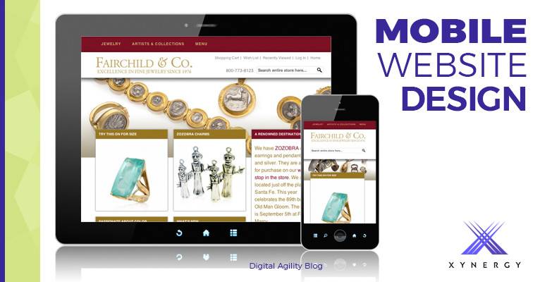
By now, most everyone knows that when building a website, you must cater it to mobile users as well.
When mobile devices first became popular, one of the most common techniques for catering to this new medium was to have completely separate URL for mobile content, effectively separating the mobile site from the desktop site. When a page was requested, the website detected what kind of user you were, based on information in your browser, and then redirected you to the appropriate version. (You may have noticed sites like this if you were ever redirected to a sub-domain like m.yourwebsite.com on a mobile device.)
This technique has virtually disappeared today, mainly because, as a site owner, you have to maintain two separate websites and be very careful to correctly link the desktop and mobile pages, which makes initial development more expensive and content editing much more difficult. In recent years, two other techniques have become more popular: Responsive Design and Adaptive Design.

Responsive Design is a widely popular technique that uses the same URL for both mobile and desktop content and displays the same HTML to all devices as well, but uses CSS (Cascading Style Sheets, a style sheet language used for describing the presentation of a document written in a markup language) to change the layout of the page, based on the screen-width of the device. The main benefit to site owners is that there is only one site to manage—editing content in one place does so for all users and thereby typically reduces the cost of the initial development and makes it easier to manage content.
Responsive design ensures users receive the same content across all devices (albeit in a different layout), handles all screen sizes and screen resizing well (think: rotating a tablet from landscape to portrait), and is generally easier for developers to implement, particularly when working with popular content management systems like WordPress and ExpressionEngine.
The downside of responsive design is that the resources sent to the user must cater to all devices. In other words, content is sent to the user regardless of whether it’s being used at a specific screen size. For instance, mobile devices typically don’t need the same size or resolution graphics as desktops do, so mobile devices often end up downloading graphics that are larger than necessary or completely hidden to the user, but still have to be downloaded anyway.
Most of the websites we create here at Xynergy are already Responsive. CSS3, media queries, flexible media, and fluid grids are—by default—built into most of the templates we use. This provides the baseline for a mobile-friendly experience.

Adaptive web design has been called “Responsive 2.0.” Rather than challenging the Responsive approach, Adaptive takes things a step further by using JavaScript and server-side detection methods to target specific devices. This is also called “Dynamic Serving.” Dynamic serving serves different code and media to each device, but on the same URL. This gives you very specific control over the user experience on a particular device. (Although, this can also add complexity, and therefore cost, in the initial development, as well as adding in complexity—to maintenance both of the site and the content.)
However, even Google says that this device-targeting method is a high-maintenance, error-prone technique.
So. Even if the technology is there, what, then, is the most feasible way to implement it?
Google, of course, who dictates so much of what we all do, says they have the answer. Their answer being the Amp Project.
AMP stands for Accelerated Mobile Pages.
AMP is Google’s open framework built from existing technologies, and is essentially an Adaptive Web Design—only adaptive in the way Google wants it to adapt. Google takes care of the advanced technology, while giving you the ability to hook into it via JavaScript and specially formatted HTML. To promote the widespread use of AMP, Google intends to open their cache servers to be used by anyone free of charge.
AMP pages are super fast, with all performance improvements usually recommended by Google already built-in. To see AMP in action, visit Amp By Example.
Going forward, we at Xynergy plan to offer AMP as an added feature for optimizing the mobile experience. And as the technology becomes more widespread and familiar, we hope to offer AMP as a standard feature for all websites.
For now, AMP appears to be the most reliable way to ensure your mobile pages are loading quickly and being recognized in the way Google wants. And since Google usually gets what they want, it makes sense to adopt AMP technology wherever possible in future development.
Contact us for help with your Mobile Development.
or Call 505-557-7780

