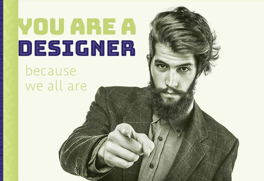
A designer is not some heroic super-hipster sipping a $5 cappuccino while puzzling over a macbook in a beautifully lit, industrial-chic coffee shop. A designer is someone who plans out the look or form of content for a visual medium. Everybody is a designer - we all make design decisions. The idea of designers as a different breed, separate from the rest of us, abdicates responsibility from our own design choices. Embrace it—you are a designer.
 The decisions you make regarding look and form will either improve or detract from the media you create. Any time you create content for your website, social media, or even send an email, you’re designing. Learn to make good decisions—it can make a world of difference.
This doesn’t mean you shouldn’t hire a competent, professional designer for high-impact content. In fact, quite the opposite is true. Hire a professional when impact really matters! But, for more commonplace content, a little training can have real results that impact your viewer's perception of you and your brand.
Just a quick note: This article is focused on design for the web, but is equally applicable to almost any media: email, PowerPoint presentations, Word documents, your kid's science fair project, whatever.
Contents
Basic Design Principles
Consistency is king - People are more comfortable around things that are predictable. This principle is why people prefer songs they know, and it’s why big corporations blast you with their branding ad-nauseum. This is a well studied phenomenon called cognitive ease, and results from some fascinating evolution of the brain. Natural selection likes good design! Put this to good use, and apply the same styles and layouts consistently in your design.
Use lots of whitespace - Use whitespace to create groupings of related content. Use plenty of space between paragraphs, headers, and especially different sections of content. If there is such a thing as a magic wand in the world of design, it’s whitespace.
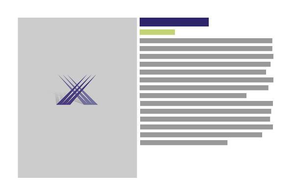
Example: Whitespace
Emphasize hierarchy - Use font size, font weight, color, and whitespace to create clear groups of related content. More important elements should be more prominent in these groups. Bolder, colored, and larger elements are perceived as more important.
Use relevant images, and size them appropriately - Don’t use 5000 x 4000 pixel images. If your image doesn’t fill the same amount of width as the text near it, make sure the text wraps well, or else use a larger image. Also, be consistent with image sizes across the site.
Keep it simple - While one may achieve a deep sense of gratification from expounding at great length and in elaborate language upon a subject of one’s expertise, this author would proffer the following recommendation: don’t.
Take the time to simplify your language and page structure. As the great scientist Blaise Pascal said all the way back in 1657,
“I have made this longer than usual because I have not had time to make it shorter.”
Had he a little more time, he could have simply stated:
“If I had more time, I would have written a shorter letter.”
Typography
Thanks to hundreds of years of dedicated, talented designers, we live in a world with rich, versatile typography. Rather than delve into the many nuances of typefaces—humanist vs geometric fonts, x-height, baselines, ascenders, descenders and terminals—we’ll keep it to the basics. If your goal is clear, attractive, and legible typography, then you don’t necessarily need all of that anyways (but if you want exceptional results, again, seek out a professional).
Whitespace
One of the most common mistakes people make when laying out visual designs is to ignore how much empty space goes around their content. Avoid cramped layouts and you will already be well ahead of the competition.
I like to think of the layout and design of a page like interior design: if you have lots of intentionally empty space in your house, you appear to be neat, organized, and rich. Users have the same psychological response to page layout, and while it may be prohibitively expensive to purchase so much square footage in your home, space is cheap on the web. Use it.
Where to Consider Whitespace
- Between images and text
- Between paragraphs
- Between lines on the page
- Above headers
- At the end of large content sections of the page
- Before indents
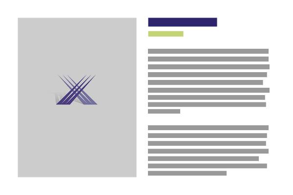
Example: Where to Add Whitespace
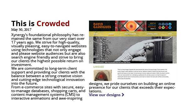
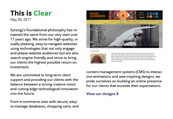
In the second example, “This is Clear,” everything is much more legible, even with a relatively small size 12 font, because the design pads everything with comfortable and consistent whitespace:
- 24px between columns
- 24px between the title group (title and date) and the paragraph text
- 12px between paragraphs
- 16px line-spacing (an extra 4px)
Creating Hierarchy
Notice that the title and the date are grouped together. This way users quickly understand that the article was published on that date, rather than associating it with the text below, which would confusingly suggest the date had something to do with the first paragraph rather than the whole article.
The font weight of the date has been set to "light" in order to decrease its visual weight—this creates a stronger sense of hierarchy because the title doesn't visually compete with the date despite their close proximity.
Fonts
The two largest categories of fonts you’ll come across are serif and sans-serif fonts. Serif fonts have little caps called serifs on the letters, making them look fancy and giving them an older aesthetic. Sans-serif fonts do not have these caps, and are generally built from simpler shapes.


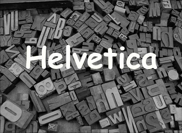
Sans-Serif
Because of their simplicity, sans-serif fonts tend to feel more modern and direct. They are also easier to read at small sizes, and are generally designed to be web-friendly. If you’re not sure what to do, it’s hard to go wrong with a modern, sans-serif font.
Some good sans-serif fonts for the web
Arial, Helvetica, Open Sans, Lato, Trebuchet, Verdana
Serif
Serif fonts can look antiquated on the web, and can also be harder to read. They are usually better suited for print. Generally speaking, use these carefully, and usually at larger sizes. They can be used to set the tone for titles (often looking like news headlines), or over images.
If you’re trying use serif fonts on the web, consider Georgia as a commonly available, web-friendly option. Other web-friendly serif fonts are Merriweather, Lustria, and Roboto Slab.
For print, you can use classics like Garamond and Times New Roman, but avoid them for the web, as they can appear small, blurry and hard to read on screens.
Other Fonts
 There are other categories, like fonts that mimic handwriting, look like old wanted posters, calligraphy, or a punch to the face from an old comic book - but be warned! Use these sparingly, if at all. Unless you’re trying to be ironic, do not use Comic Sans or Papyrus. They have their place, but are widely misused and show as red-flags to more design-literate audiences.
Resources
There are countless good choices for fonts on the web. A great resource for web-friendly fonts is Google Fonts, but be warned, it takes some technical expertise to use a font that a developer has not installed on your website (including some of those suggested in this article). You’re best off choosing from the fonts available in whatever editor you’re using.
Font Sizes
 Users are lazy, and while they can resize web-fonts in their browsers, so many do not. Be user-friendly, and choose legible fonts at reasonable sizes. For promotional material, it’s hard to go too large. For body copy, don’t go lower than 14pt in size. I aim for 16pt whenever possible. It’s easy to read on almost all devices, even for people who are somewhat farsighted.
If you have control over headers and titles, a good guideline for choosing font size is to choose multiples of 4, so 16, 20, 24, 28, 32, etc… Consistency in this shows an underlying logic to the typography of the site, and while users may not notice this consciously, they will feel more comfortable with the result.
Imagery
The imagery you associate with your content casts you, your products, and your brand in a certain light. Again, consistency is king. Choose graphics that reinforce the image you want to convey to the world. Wherever possible, use branded colors, if you have them (and if you don’t consider hiring some branding professionals to forge a strong brand identity for your business).
An important thing to consider is how large to make your images, and whether to crop them. Apply the “Goldilocks Principle” here: not too large, not too small. If you are using images that are too small, they create awkward whitespace or strange text columns. If your images are too large, then it will take too long to load, and you might lose traffic on the site, especially mobile users.
If resizing, cropping, and compressing images seems difficult, don’t despair. Here are step-by-step instructions for resizing images on both PC and Mac. Cropping is less important, but if you use WordPress or Expression Engine, both provide tools to crop your images.
If you had your site designed by a pro, they should be able to advise you regarding what size to use. Here at Xynergy, we train our clients to use their CMS in order to crop images, and generally suggest image sizes for different parts of the site. Feel free to send us an email if you would like us to advise you on this, or any other elements of your site.
Some general guidelines regarding image width
| Image Width | Purpose/Device |
|---|---|
| Resizing images on a PC | Resizing images on a Mac |
| 1920px | Desktop Hero Images (full width of the browser) |
| 1200px | Full, centered column width (no sidebar) |
| 980px | Full, centered column width (with sidebar) |
| 767px | Full width on tablet and below |
| 480px | Small image with text wrapping, full width on mobile |
Stock Images
Professionally taken photos of all manner of subject matter exists out there, much of it available for free if you know where to look. A word of caution, however: lots of sites use the same stock photos, and nobody’s fooled into thinking that gorgeous and extremely well lit model is a member of your staff or is actually using your product. It's also worth remembering that stock photos tend to use young, attractive, and often white models, and so this could alienate your users if you aren't conscientious.
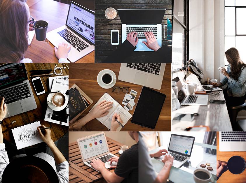
As a general rule, it’s better to use imagery that’s relevant to your content, and nothing is more relevant than actual images of you, your product, your staff, your city, your business, etc... This is especially true if you’re branding yourself as “local,” as so many small businesses do these days.
With that made clear, stock imagery is still super useful. I use it all the time in my design work. Here are some resources for you to tastefully put to use:
| Type of Imagery | Website |
|---|---|
| Totally Free Stock Images (no attribution) | Unsplash.com Pexels.com Pixwizard.com |
| Icons (Free with attribution) | The Noun Project |
| Vector Art (Free with attribution) | Freevector.com |
Usability
Usability is the essence of design. It’s not about creating something flashy - we’ve all seen websites that look cool but quickly become annoying, glitchy, and difficult to navigate. Instead, when media is legible, clearly structured, and understands its user’s needs, it’s utilitarian beauty shines through in the improved lives and experiences of it’s users. Improved usability can also result in more sales, better image for your brand, and better relationships all around.
It’s all about the user. Google’s famous motto (in the world of design, at least) puts it clearly:
Focus on the user and all else will follow
In fact, that’s the title of a paper published by Google way back in ‘08. (link or it didn’t happen).
In order to reflect this principle in your design decisions, ask yourself these questions:
Usability Questions
Is it clear what this does? For example, a button or link that says “Learn More” is not as clear as one that says “Digital Marketing Gets Results.”
Similarly, placement of a button or link can change it’s meaning by what it’s associated with.
Example: Grouping and Hierarchy
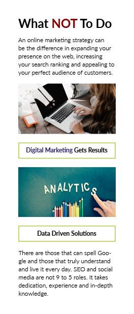

In the “A Better Solution” example on the right, notice how the extra space between groups clearly associates the first button with the top content, whereas in the "What Not To Do" example, that button is not obviously associated with either group.
Hierarchy and Consistency
Using a consistent pattern for the layout (image, then text, then button) reinforces the grouping and creates a more clear hierarchy. The result is that this pattern is much quicker to scan, and the user can more easily find what she is looking for.
Does each element have a single, clear purpose? For example, if a paragraph is trying to make multiple, distantly related points, then it’s probably best to break that into multiple paragraphs. This principle also applies to images: if an image is seemingly unrelated to its associated content, then consider moving or removing that image.
Is there a clear visual hierarchy? This makes for quick scanning to find relevant content, and avoids confusion about the purpose and intention behind the various elements of the design.
Is everything legible, even for people with limited visibility? If you are currently fortunate enough to see clearly without glasses, then this especially applies to you. What might seem comfortable to you might seem like tiny or cramped text to your audience. When in doubt, err on the side of larger content with plenty of breathing room over smaller, more crowded content.
Could I simplify this and have the same meaning? You’ve probably been hearing a version of this since grade school, but it’s worth keeping in mind. This applies to the text you write, but also to other design elements like imagery, layout, and typography.
Can I scan this easily? Don’t make users delve into paragraphs of long text to figure out what each section is about. Use titles, subtitles, color, font-weight, bullet-points, and whitespace to make your content easy to scan - long, dense paragraphs scare users off.
Am I being consistent? Aim for consistency in all elements you create. Consistent typography, spacing, layout and color all lead to clearer, more usable content.
Testing
Testing is all the rage in design these days, and for good reason. Usability testing is a whole industry on its own, and usability issues have real world, bottom line consequences.
For the purposes of some DIY design for your own web-management and content creation, you won’t need huge teams of testers, A/B tests and millions of users (but if you do want more advanced testing, like A/B testing and personalization, Xynergy provides these services as part of its digital marketing packages). Here’s a simple process for testing that will iron out the majority of issues.
The Testing Process
Take a break. Get some space from the content you’ve been so carefully creating. Seriously. Go for a walk, have a drink, take a nap. This will make a world of difference.
Make a list of different kinds of users you expect to interact with the site. For each user, write down their highest priority when interacting with the site, and write down anything you can think of that will drive them away.
Read everything in its final form. Do this in the actual environment users will see (so a browser, probably). Wordpress allows you to preview your content, but if your CMS doesn’t go ahead and publish your content and then read over it like you’re a user just arriving at the site.
Compare your list of user expectations and pain points - go back and fix anything that might cause the user a headache, and make sure the users’ highest priorities are clearly addressed.
Publish the site if you haven’t yet. Celebrate!
Go Forth, Designer
So, you’ve studied up, simplified your language, and picked relevant, well sized images. Your paragraphs breathe, thanks to that lovely whitespace you packed them in. Now, the layout oozes hierarchy, and branded colors tastefully decorate your spacious, minimalist design. You’ve even gone the extra mile, put yourself in your users’ shoes, and read through your page a few times, and on a few devices, adjusting elements until everything feels balanced and clear.
Congratulations! And thank you for taking responsibility for the design decisions you make every day.
If this was a challenge, take solace in knowing that it gets easier with time. For those of you craving more, itching to delve into the nuances of type, color theory, and negative space, there are a plethora of good and free resources out there. I’d recommend Coursera for free classes designed and taught by professors from acclaimed universities.
Whatever you do, never stop learning.
Contact us for help with your Design.
or Call 505-557-7780
